
Hotels.com Responsive Redesign
Project Overview
The team worked on increasing trust in Hotels.com. Usability testing resulted in 100% increase in booking.
Team
Zarah Ferrari UX Researcher/ UI Designer
Katie Luo UI Designer
Roma Patel UX Researcher/ UI Designer

Scope
1 Week
What Are Users Saying About Hotels.com?
They Don't Trust It Enough To Directly Book
Existing site usability testing on four users revealed users do not book on Hotels.com because they did not trust the site. Users did not trust that the site was showing the final price and thus would go to other sites to book accommodations.

3/4
users opened competitors sites to compare deals on similar hotels.

4/4
users wanted a price breakdown
What Are Users Mental Model When Booking?
I Conducted User Interviews To Find Out
Using a screener survey, 4 qualifying candidates who had traveled in the past year and primarily chose hotels for their travel accommodations were selected out of 31 participants.
I drafted a user discussion guide, and conducted, documented, and transcribed all interview to determine the mental model of users before, during, and after their travel booking process.
No Price Transparency, No Trust
The team affinity mapped observations derived from user interviews. I came up with key insights using 'i' statements. We found in our interviews that users directly associate price transparency with trust.
Wants hotel pricing to be more transparent
Feels hotel deals run out quickly
Price is the most important
I want price transparency
Who Is Our Primary User?
Direct from user research, I defined the primary user for hotels.com considering the needs, behaviors, pain points, and goals across the touch points of the booking process.
Meet Xia!
Xia is a product manager from New York city who frequently travels for work and books hotels. She wants to book more efficiently with less stress.
Needs
Ability to see the best deals when available
Pain Points
Hidden fees that Jack up prices
Behaviours
Uses filters to find the best deals
Goals
Find the best price for the experience
I feel like I'd have to refresh the page multiple times to see what deals I can get because they're not going to explicitly show me
Xia Doesn't Trust She Is Getting The Best Deal
Distrust Leads To Lost Bookings
With the problem space defined, the team used a journey map to chart Xia's actions and emotions throughout various touchpoints in the booking process. By doing so, we identified the compare phase as a key pain low point and potential areas of opportunity.
I tend to open every single website just to compare them and see which one has the best prices

How might we make the true cost of accommodations more transparent to Xia?
WHAT ARE THE MVPS?
Building Trust Through Price Transparency
From a design studio, I drafted low fidelity wireframes and tested them with one user to validate our design solution for creating user trust on hotels.com through persistent price transparency throughout the booking process and a comparison tool.
Did Users Trust Our Redesign?
Almost, But Not Quite
After I tested the low fidelity prototype, I led a second design studio to iterate on the compare tool design. The mid fidelity prototype was then tested on three primary users to streamline the design moving into high fidelity.
Why can't I see any of the information before the booking page?

2/3
Users wanted more price transparency earlier in the booking process

3/3
Users wanted more price visibility and wealth of content within the compare tool.
Price Transparency
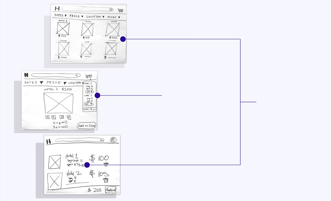
Comparison Tool
The compare tools allows Xia to add hotels to her cart so she can easily compare the hotel prices and amenities available.
A price forward layout helps Xia feel the cost of accommodations are upfront when she is searching for hotels that fit her needs.
How Do We Increase Price Transparency?
Put Xia In The Drivers Seat, Hand Her The Keys
After I tested the low fidelity prototype, I led a second design studio to iterate on the compare tool design. The mid fidelity prototype was then tested on three primary users to streamline the design moving into high fidelity. Our goal moving into high fidelity was to increase price transparency in order to yield a trustworthy booking experience.
SHOW XIA EVERYTHING

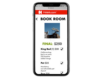
Persistant Price Breakdown
Xia can clearly review both the price and descriptions of the accommodations for each hotel. The selection tool for allows for her to have control over the final price of the hotel.
EASE FRICTION

High Visibility Compare Tool
To mitigate the frustration Xia experiences during the compare phase, Xia is able to view multiple hotels in a side by side price comparison with high visibility.
4/4
users booked a hotel and found
the compare tool useful during the booking process

Did Users Trust Our Mockup?
Enough To Book, But UI Needs Improvement
I trust Kayak more because it looks nicer