
IDentify Native App Design

Project Overview
Our team of UX designers focused on the problem space of first generation Americans encountering language barriers when navigating physical drug stores. We created a product that will help users in physical drug stores identify the products they are looking at so they can successfully purchase them.
Team
Zarah Ferrari UX Researcher/ UI Designer
Hope Magracia UX Researcher/ UI Designer
Valeria Lebedava UI Designer
Scope
1 Week
What Do ESL Users Experience When Moving To the U.S.?
They Are Afraid Of Speaking English
Using a screener survey, 4 qualifying candidates who have had personal difficulty with finding the products they need in the U.S. due to a language barrier. I drafted a user discussion guide, documented and transcribed all interviews and interviewed all of the candidates to determine the mental model of users who enter unfamiliar stores.
From the discussion guide, one of the most high yielding questions in terms of user data was: Tell me about the first time you went to a U.S. store.
Through this question, users illustrated a deeply impactful life experience and recounted unanticipated pain points that had major impact on the product design.
4/4
users were afraid of saying something ‘wrong’ in English for fear of facing backlash
The team affinity mapped the observations found through the user interviews and drew key insights in the form of 'I' statements.
The observation is that our users did not ask for help from store workers when first coming to the U.S. to find the products they needed when they could not identify the correct products to buy, leading them to leave the store without assistance. The insight is that users do not feel safe and the stakes are high.
Previous experience helps me find an item
I was not familiar with the U.S. drug brands and it was difficult to choose
There are more items here and I am not familiar with any of them
I find products based on familiarity
Users Leave The Store Empty Handed
What Happens When Users Are In An Unfamiliar Store?
Who Is Our User?
Meet Jaxon!
Direct from user research, I defined the primary user for hotels.com considering the needs, behaviors, pain points, and goals across the touch points of purchasing a convenience store item.
Jaxon just arrived to the U.S. from Brazil with limited english fluency. He has come down with the flu and needs over the counter medication. He runs to the pharmacy to remedy his symptoms, but has trouble identifying and choosing the right product.
Needs
Behaviours
Identify the context of user for products based on how they look
Chooses what products to buy based on brand familiarity
Pain Points
Goals
Afraid to ask for help with limited knowledge of U.S. stores
Find the items he needs to quickly and easily treat his symptoms
I would walk away because I couldn't communicate
How might we help Jaxon gain familiarity with U.S. products in drugstores so he can feel confident he is purchasing the right products to meet his needs?
What Happens When Jaxon Needs To Purchase Medicine in The U.S.?
Tons of Products, But No Context of Use
From the user persona, we created a journey map to better understand Jaxon’s emotions, actions, and phases throughout the different touch points of finding a product he needs in a U.S. drugstore.
Through the journey map, the team was able to identify a key pain point for users was that
While 4/4 users use google translate when trying to find the products they need, google translate does not provide the context that users need to find the products for their symptoms.

Combining Google Translate With The CVS App
Based on this competitive analysis we wanted to combine what CVS offers with Google translate, giving users like Jaxon a way to confidently find products in his language with the context that is necessary to understand what a product is and how it is used.

What Functionality Does Jaxon Need?
Comparison To Provide Context
What Else Is On The Market?
Competitive Analysis To Fill The Gaps
To better understand the product that would best fit the users’ needs, we needed to analyze the current competitive landscape. By looking at what already exists we can not only gain a greater understanding of what is familiar to users and therefore intuitive to them, but where there might be potential gaps in the market or over-saturation. For our analysis, we created a competitive matrix to visually articulate major players in the marketplace and our products’ potential fit.

Google Translate
+

CVS APP
When I first arrived from the Haiti, I wasn't familiar with the U.S. drugs and it was difficult to choose
To figure out what features to include, we mapped did a feature analysis to better understand what features particularly already exist for our competitors and comparators. Given this feature analysis, the team came up with a Moscow Map, which is a feature prioritization chart to help us better understand what features existing in the current competitive landscape were relevant to users like Jaxon and his particular use case. Based on competitive and user research, one key feature the team focused on was the ability for Jaxon to compare U.S. products to his home country products to provide context of use.
User Centered Design Is Accessible Design
Accessibility Is Not An Edge Case
To jumpstart our ideas for a potential solution to Jaxon’s problems with identifying medication, we began with a design studio, moving through an iterative design process to quickly draft ideas incorporating our user research and feature analysis. From the design studio we came up with a low fidelity design. I tested our low fidelity wireframes on one user to reveal main usability issues with the comparison feature.
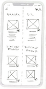
Regardless of English fluency, Jaxon is able to choose his native language, take a picture of an item in a U.S. store and be presented with comparative items from his home country, providing necessary context of use, as Jaxon typically chooses items based on product familiarity.
Choose Language

Start
Decision
Take a picture or search by voice

Take Photo
Choose Product


Voice Record
Choose Product
Compare
Product
Favorite
Product


Is Our App Useful To Jaxon?
5/5 Users Can't Wait For It
Moving into the mid fidelity prototype we returned back to our Moscow Map to zero in on the features that we would ultimately include in our mid fidelity design. We tested our design on 5 users to determine the success of the compare tool.
I would say that it is very intuitive throughout
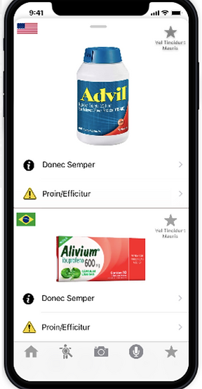
Swipe To Compare

Once Jaxon has taken a picture of the product, he is able to view a detailed product description in his native language. If he swipes up , from the bottom of the screen he can compare the product with a similar product from their home country to provide Jaxon with context of us.
Symptom Icons
Product Use
Swipe Functionality

The user is able to see a side by side comparison with an image forward design of the products, and have the optionality to click into each product to view more relevant information in regards to warnings, use, and corresponding symptoms.
Detailed Comparison
Multiple High Visibility Images
Detailed Product Use
Pivots Moving Into High Fidelity?
1:1 Product Match
Incorporating user feedback from the mid-fi usability tests, users expect a 1:1 match based on the product they are interested in purchasing.
Single High Visibility Image
5/5
Our product provides context while “Google translate fails sometimes because it doesn't tell you exactly what ingredients there are for example”
Users Found IDentify Useful and Intuitive
Final Thoughts
When you solve for the minority, you solve for everyone
IDentify aligned with my ethics to create a product that made everyday tasks more accessible to users with limited ability. IDentify, while by no means flawless, is a step in the right direction for an issue that affects millions of Americans. In next steps, I would like to improve the UI and streamline the functionality.